8 January 2013
How I Sold Gaslight On Our New Brand

by Kristin Lasita
The scariest task to be given to a brand new designer on a first day: “Rebrand
our company”. Even scarier? There is no one decision maker. So began the
Gaslight rebranding!
A little backstory. Before I began at Gaslight, I had interned with 4 graphic
design firms. Each had different emphasis, from Pampers packaging to doing the
field wall for the Orange Bowl. The one thing in common with all of these
places was that design was the emphasis. We didn’t worry about how anything
worked, just that it was designed on the surface. Gaslight is different. But
that’s another blogpost, for another day.
So back to the challenge at hand: a rebrand. Something I had experience in
school, but never in the real world. I was confident I could produce the work,
but I encountered a new obstacle: at every point of the process, I was selling
the idea of a brand to the company, and it was not always easy. First off, I
had to grasp that I’m not the intern anymore, nor am I a junior designer (aka
glorified intern). I’m in charge, and have to trust my instincts. I get to put
my stamp on things, I get to be involved, I feel like I’m making a real impact
right away. I had a group of people that was ready… ok kinda ready, to open
their company up to a new approach. I was up for the challenge, and after a
bumpy start, finally got the design and opinions moving in the right
direction.
Now the good stuff.
A Little About a Logo

What do I think a logo is? The “face of your company”, what people see on a
site, on a card that represents your company. It can be as simple as swoosh,
or as hated a square with the word “Gap” written next to it. Once the name
Gaslight was settled on, I began the process of creating a logo for the
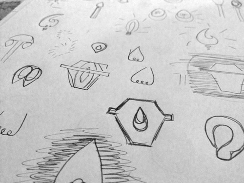
company. I’m traditional and I like to start with paper sketches. I often find
my thoughts more confined when I first begin on the computer. With pen and
paper, I have the ability to get a lot of ideas out quickly. No matter how
much of a hurry I am in, for logo or a UI, I always start this way because the
end product is always more well thought-out.
Next, I picked a few sketches and started to digitalize them, still playing
with forms and typefaces. At this point, everything is in black and white as
well. I also made the decision to move away from the flame icon. It’s a fine
icon, but it’s so hard to come up with an ownable mark that is a flame. The
company was split, some wanted a flame reference, some wanted something new.
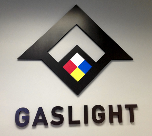
Happily for me, a very geometric and different direction was chosen.
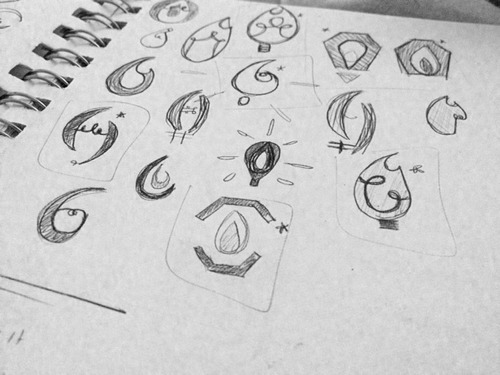

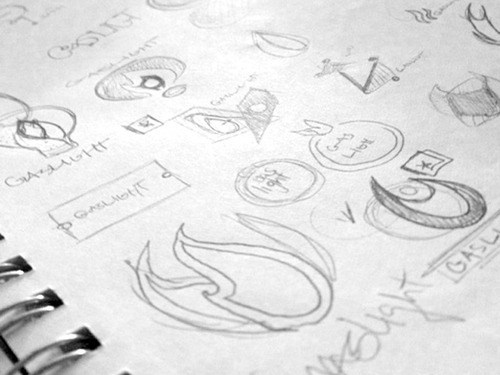
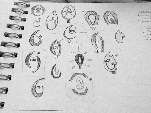
The original idea of the mark came from playing with
Once the mark was drawn, I moved onto choosing a typeface. In case you’re
curious, we chose DIN, a wonderful sans serif, with a little flair on the
letters. We can’t be boring. I set the name in all caps to get those straight
lines across, reinforcing the geometric qualities.
The colors? There is where I have a little less reasoning. There is so much
blue out in the tech world, and I wanted to show we were different. The pop-y,
primary colors allowed a sense of whimsy into our otherwise very geometric
mark. We are a creative bunch, and I wanted to show that off.
So, we have a gaslight, rendered in a strong geometric form. It’s a little
playful, but still strong and established, like the company it’s representing.
Boom, logo.
Done? Not at all. I’ll have to admit, many were underwhelmed at the new
company logo and held onto the old flame.
Buy-in factor: Low
Building a Brand
At this point we had a logo. That’s it. A logo doesn’t create an experience: a
brand does. We forged forward creating elements that could be used to create a
look that could elevate the logo and represent the team. How we treat type,
how we use the brand colors, using photography and texture, copy, all of this
fuels a brand experience. This was done by exploring how our brand stood in
print, in the environment, and of course digitally.
In Print
The first thing that really had some “brand” to it was our business card. Yes
there was the logo, but the type treatment, cut corner, and graphic on the
front all elevated elements of the logo and creates an experience. I was
starting to establish the feel of our brand, and how we were perceived beyond
a logo.
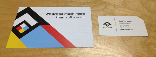
Another thing on the top of the list was a postcard to announce the new and
improved Gaslight. It was meant to spark an interest in how we are different…
we’re bigger and better. It was also our first crack at copy-writing in our
brand voice. We wanted the voice to be fun and conversational. We’re more than
faceless people; We’re trying to have fun with who we are with some customized
code.
This was the first turning point, when the Gaslight team realized that there
is more to this than a logo. There was a voice behind us, and a distinct
style. I was starting to get some thumbs up where before I got frowns.
Buy-in factor: Medium
Environment
At the same time all this was occurring, our office-mates at Neo headed out to
their new pad. We were left with a ton of space and a lot of white walls.
White is boring, and we’re not a boring group of people. Brands don’t have to
live on a computer or on a piece of paper, it can be alive in the environment.
Big agencies have a branded area where people have an experience when they
walk in. Why couldn’t we do that? I had a branded space vision, but when the
black chalkboard paint went up on the first wall, it wasn’t looks of joy that
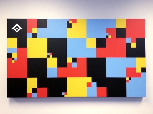
I saw. As we painted the back of the room grey, another eye-browing raising
choice at first, and moved onto our old blue wall, there began the “you know,
I really like this.” Gaslight went from scared of the black and grey, to
wanting to paint the whole place.
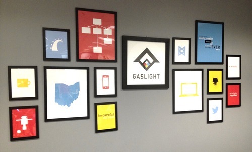
It wasn’t just paint. We created a sitting, creative area around the
chalkboard wall for brainstorms. It’s fun to get your hands dirty sometimes!
We finished off one of the grey walls with icons and quotes representing
Gaslight, and stuck a giant logo in our front room, as well as our door.
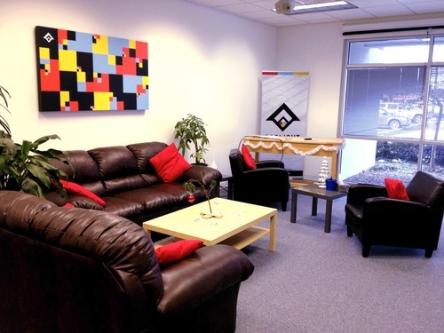
So after a step back at first, the painting ended up being a huge step forward
in terms of brand confidence. I think at this point, even if there were little
things some team members didn’t like, overall it was getting the greenlight
from everyone.
Buy-in factor: High
Web
We’re a company that puts out a digital product, so of course web presence is
important. All of this preliminary work affected how I’ve approached the
design of the website, and designing the
website has made me rethink some aspects of the
preliminary pieces. Let me explain. When we first put up a landing page to
replace the old Gaslight Software site, it was right in the beginning, and by
beginning, I mean we had the logo. I wasn’t sure what exactly our brand looked
like yet. So we put something up that worked for the time being. As I started
working out the print pieces and the environment, I realized the landing page
wasn’t conveying the mood for the direction we had moved in.
When I first started the site design, my main concept was a sense of guidance.
We’re lighting your path. I loved this idea of having this glowing gaslight,
which can help guide you on the right way for your project. I ran with this
concept, playing up color separation and linear elements. After a couple weeks
of feeling like the design wasn’t right, I stepped back and thought “How does
this display on mobile?” Constrained by this, it actually helped me distill
what I wanted to show, and what was most important. It was a turning point,
and things flowed into place.

Like the brand, the website is meant to change and
evolve. It’s a 1.0. I’m already thinking up ideas for the 1.2 and 2.0, but the
groundwork is there. We have a solid direction, for the
website and for the whole brand. It’s just time to keep
building.
Buy-in factor: Gaslighters are proud to show off the brand
Conclusion
At the point I’m writing this, it’s been 6 months. That’s nothing in the
corporate world I know, but it’s the perfect amount of time for a small
business. I feel like as the brand was accepted, I was accepted into the
Gaslight family. They have taught me so much by this experience, and I think
I’ve taught them a thing or two on how branding can really elevate a business.
Over the past month or so, I’ve really firmed up how our brand is moving
forward. There is a continuity between our office decorations to our
website (woo plug), and that is what makes a brand.
Hopefully you stick around with us, and watch our brand live and change!